
Le Concierge Medical2025Live
Le Concierge Medical
A medical travel facilitator's site, built to carry a decision most visitors are nervous about — surgery abroad. Twelve procedures, five client types and a five-step process, all reachable in a click or two.
Visit the site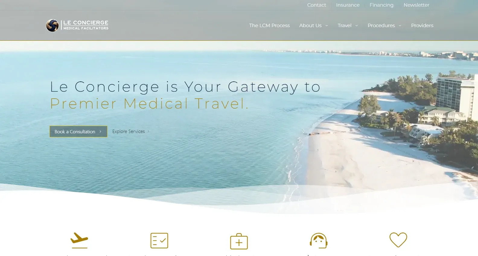

What we did
- Web design
- Front-end development
- Content structure
- Form & email integration
Built with
- HTML/CSS/JS
- Bootstrap
- Splide
- PHP
- PHPMailer
The brief
Le Concierge Medical arranges healthcare abroad — diagnostics, surgery, regenerative medicine, executive wellness — and handles the flights, accommodation and scheduling around it.
That makes for an unusually anxious visitor. Someone weighing a procedure in another country is not browsing; they are looking for reasons to trust a stranger with something that matters, and every unanswered question is a reason to close the tab. The site’s job is to answer them in the order they get asked.
The identity was already in place. Our work was the site: design and build.
Structuring an anxious decision
The homepage answers four questions in sequence, because that is the order they arrive in.
- Is this for someone like me? Five client types, named plainly — executives, wellness and longevity clients, people seeking specialised care, families, and preventative-health clients.
- Do you do the thing I need? Twelve procedures, from dental and orthopaedics through to cartilage restoration and spine care.
- What actually happens? The five steps, from the first consultation to follow-up after the client is home.
- Why you? The commitments, stated once, without repeating the list above.
Each procedure has its own anchor on the procedures page, so a specific one can be linked to directly — in an email, a message, or an ad — and the visitor lands on that procedure rather than on a page to scroll through.
A fast site with a heavy hero
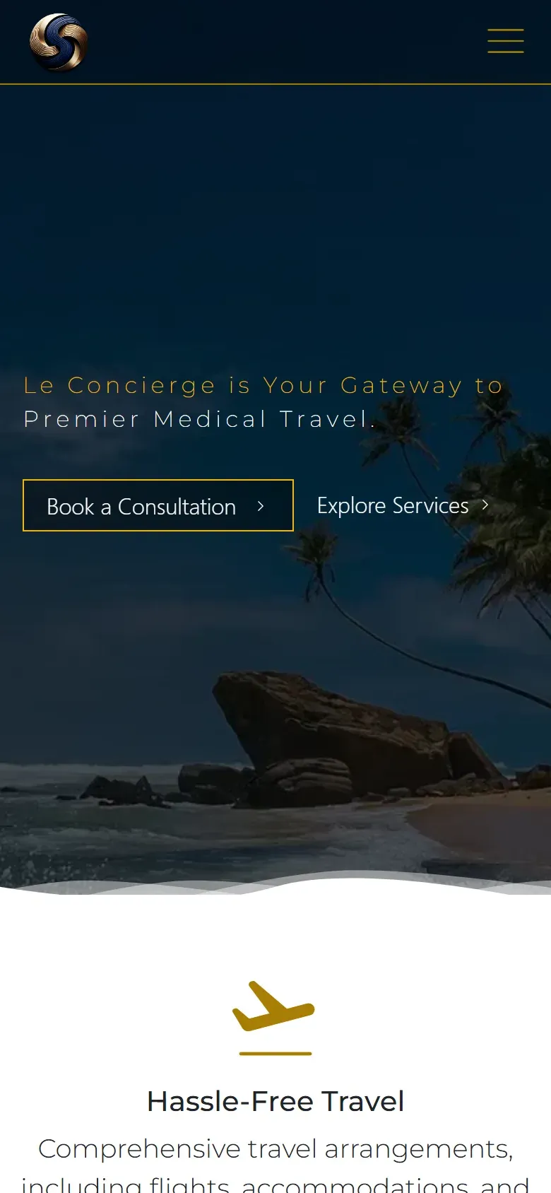
The homepage opens on aerial video. That is the right image for the business and the wrong file to send to a phone, so phones don’t get it: below tablet width the video is never loaded at all, and a still made for that shape takes its place. Visitors on a hotel connection get the picture without paying for the footage.
The header and footer are built once and shared across every page. Adding a procedure to the menu is one edit, not fifteen — and there’s no page left quietly showing last year’s navigation.
Getting in touch
The enquiry form asks for a name, an email and a message, and nothing else — qualifying happens in the consultation, not in a form field. It’s protected against bots, and it delivers straight to the company’s inbox rather than queuing in a dashboard someone has to remember to check.
Newsletter signups are separate, going to their mailing list, so a general enquiry never gets mistaken for a subscription.
Terms, a disclaimer and a privacy policy sit in the footer, which is not decoration for a business operating this close to healthcare.