
Void & Vision Tattoo2025Not yet launched
Void & Vision Tattoo
A portfolio and gallery site for a tattoo studio, where the work is the whole pitch — built to load fast and get out of the artwork's way.

What we did
- Logo design
- Web design
- Front-end development
- Gallery
Built with
- HTML/CSS/JS
- SCSS
The brief
For a tattoo studio the portfolio is the sales pitch. Everything else on the page competes with it.
The design
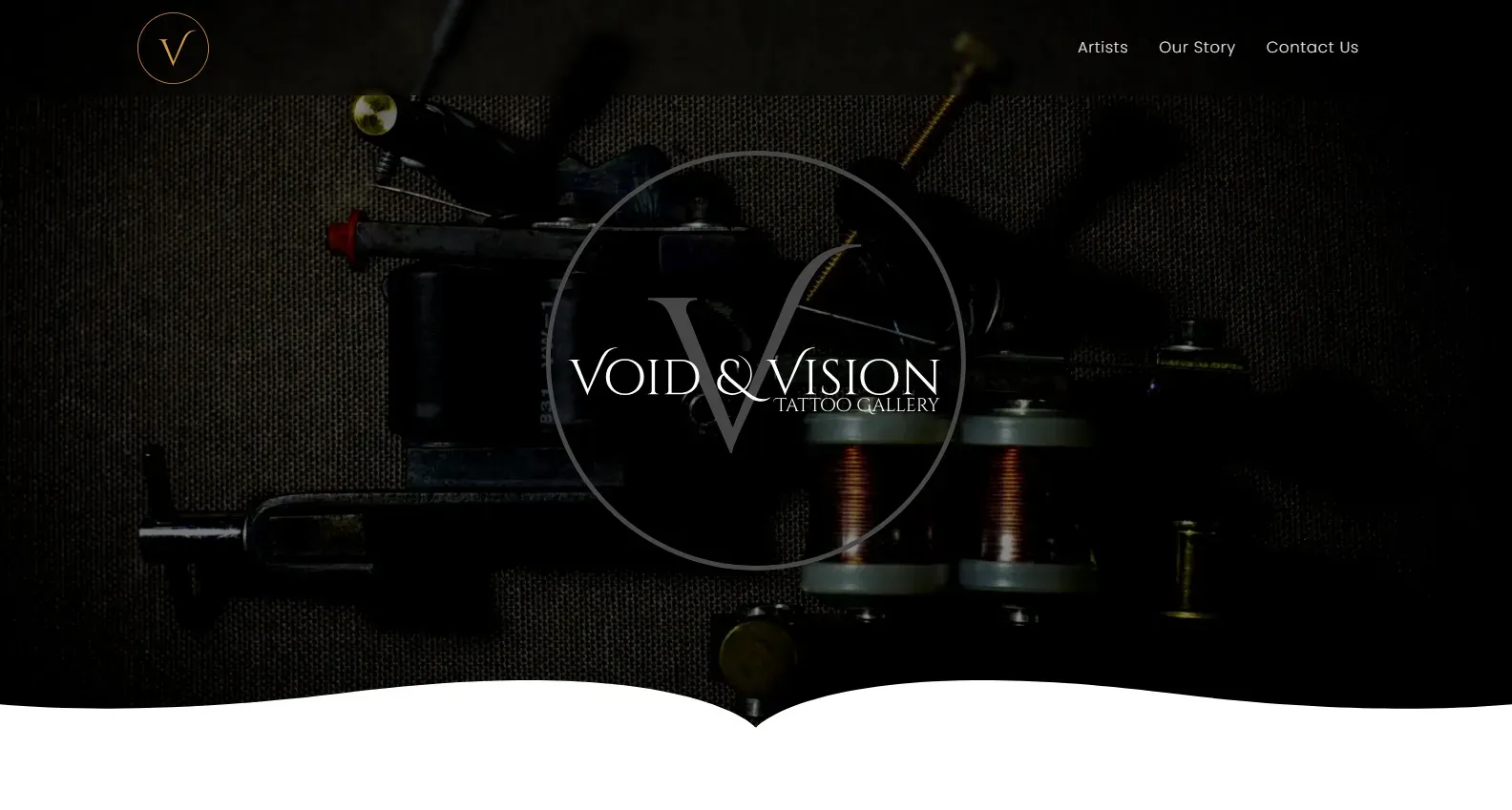
Near-black throughout. Tattoo work is high-contrast by nature, and a dark page lets ink and skin tones carry the colour instead of competing with a bright interface.
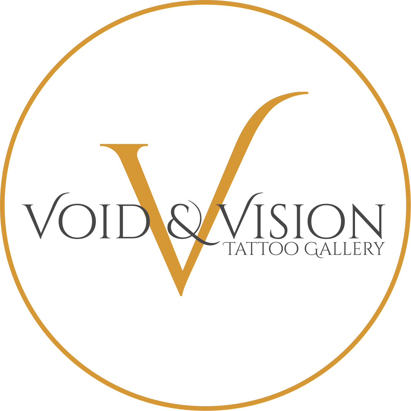
We designed the logo as well as the site. The mark is a circular monogram — a single serif V enclosed in a thin ring — sitting above an engraved-feeling wordmark. It reads closer to an old apothecary label than to a typical studio identity, which was the point: a deliberate distance from the heavy-metal styling the category defaults to, and a shape that works as a small round badge on a shopfront, a stamp, or an avatar as readily as it does in the header.
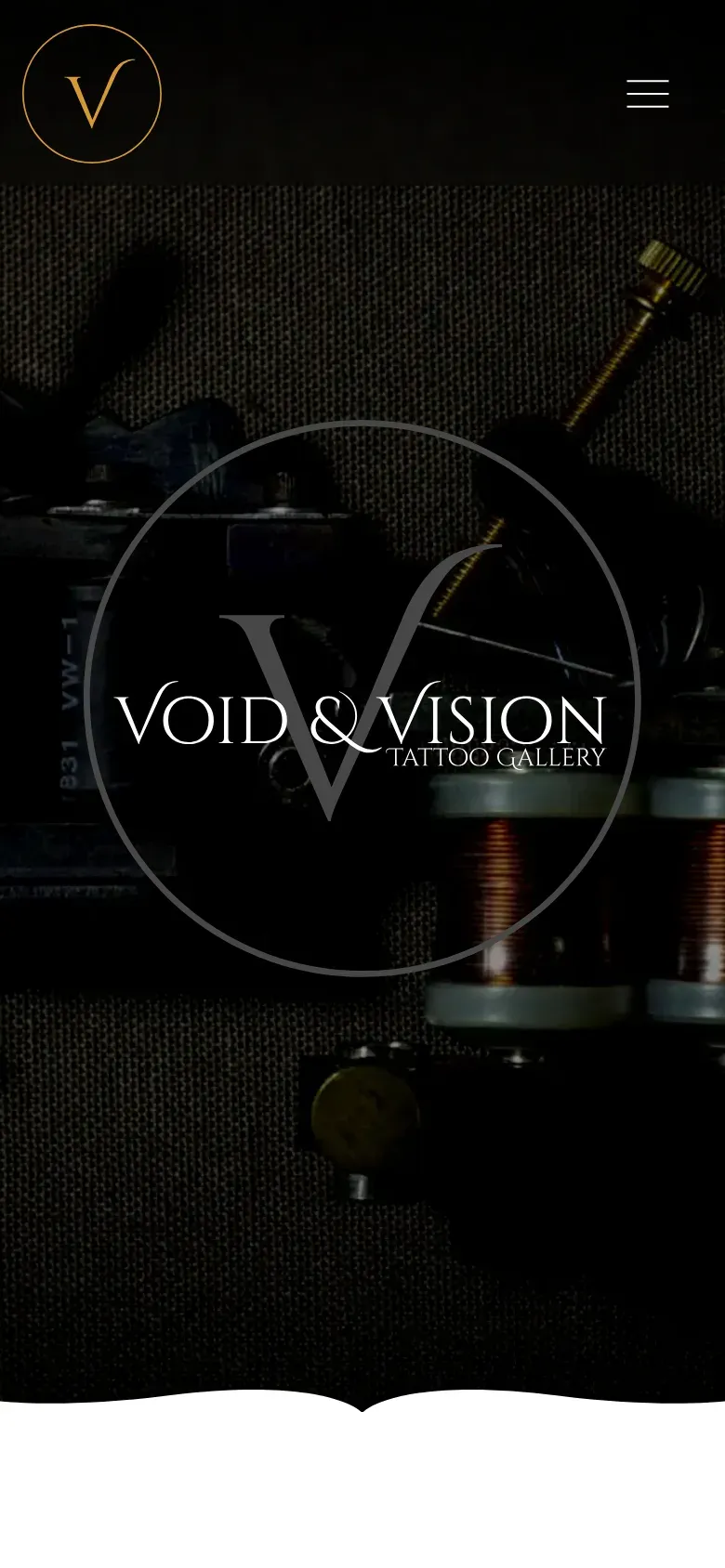
The hero opens on a macro shot of a coil machine, so the first thing a visitor meets is craft rather than a stock portrait.
Sections part with a torn, hand-drawn edge rather than a straight rule, which keeps a page that is mostly a grid of photographs from reading as a spreadsheet.
What we built
A static gallery-led site with no backend and no forms — nothing between a visitor and the artwork, and nothing to slow the photographs down.
Keeping it fully static also means it costs effectively nothing to host and has no moving parts to break.
Identity
The mark, and where it has to hold up.
Same mark, three jobs
 Shopfront72px
- Stamp40px
- Avatar24px
Void & Vision Tattoo's palette
- Gold#D69835
- Ink#474748
- Near-black#141414
The rest of the family
- Monogram, gold
 Monogram, one colour
 Lockup, reversed
 Wordmark alone